Scapes
Brief
When the competition is all bright greens and bland sans-serifs, you take a different path. For Scapes we set out to design a brand that feels welcoming and human without losing its professional edge. The logo leans into handmade elements to create warmth, and the clean but playful typography balances it out and keeps the brand grounded. Because when you get the balance right, your brand speaks before you even say a word.
Industry
Indoor landscaping, interior landscaping, plant shop, interiorscaping, plant nursery
Keywords


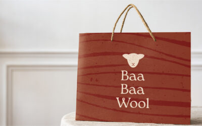
Baa Baa Wool Craft Store
Baa Baa Wool Craft Store Brief As part of my new Instagram series, I'm revamping local businesses...
vdDoorn Construction
vdDoorn Construction Brief One of the main challenges was that Hjalmar is still quite young and...
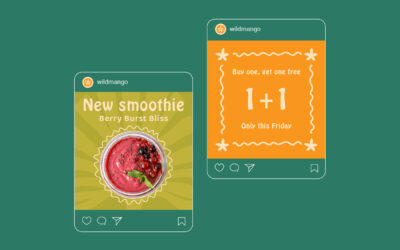
Wild Mango Juice Bar
Wild Mango Juice Bar Brief When you’re blending up sunshine in a cup, your brand should feel just...
Ready to create a brand with bite?
Let’s build a brand that’s bold, strategic, and impossible to ignore.